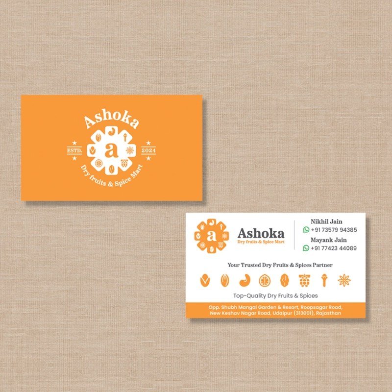
Client: Ashoka Dry Fruits & Spices Mart
Scope of Work: Brand identity and packaging system
The Challenge:
Ashoka is a retail brand offering dry fruits, spices, and chocolates to everyday Indian consumers.
The goal was to create a unified identity that works across many product types — premium in feel, affordable to produce, and easy to scale.
The Idea:
A brand that feels familiar yet fresh.
We designed a clean, flexible label system that keeps every SKU consistent while giving each product its own personality.
The design blends warmth, trust, and everyday accessibility — appealing to tier-2 and tier-3 audiences who want quality with a touch of modernity.


The Process:
- Discovery: Studied local retail behavior and packaging trends in small-city markets.
- Exploration: Built a modular label template adaptable to multiple product categories.
- Execution: Chose a color palette and typography that balance premium appeal with simplicity.
- Delivery: Created a ready-to-print packaging system that reduces production cost while keeping visual consistency.
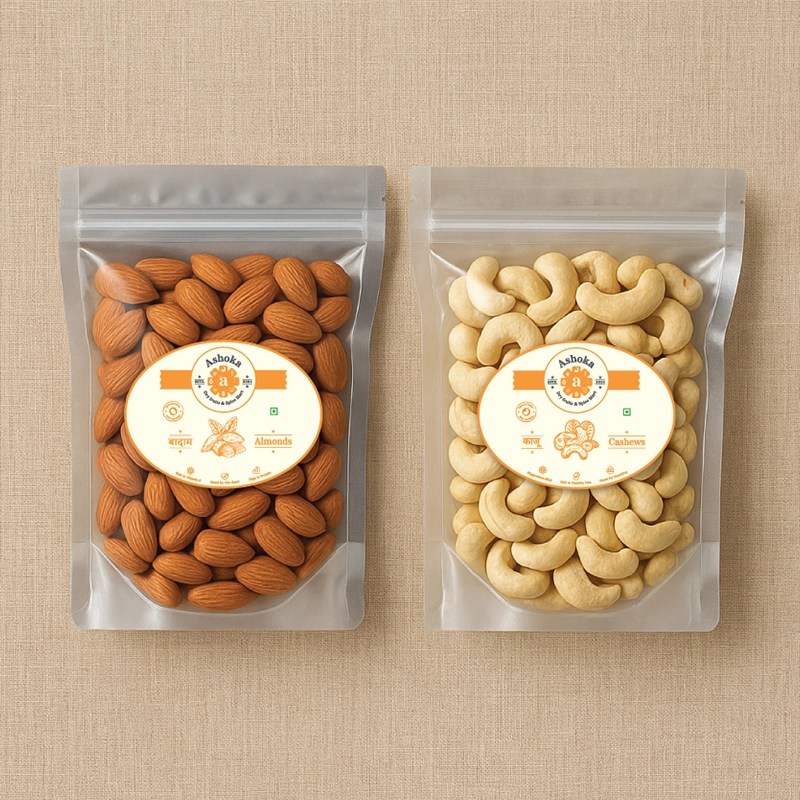
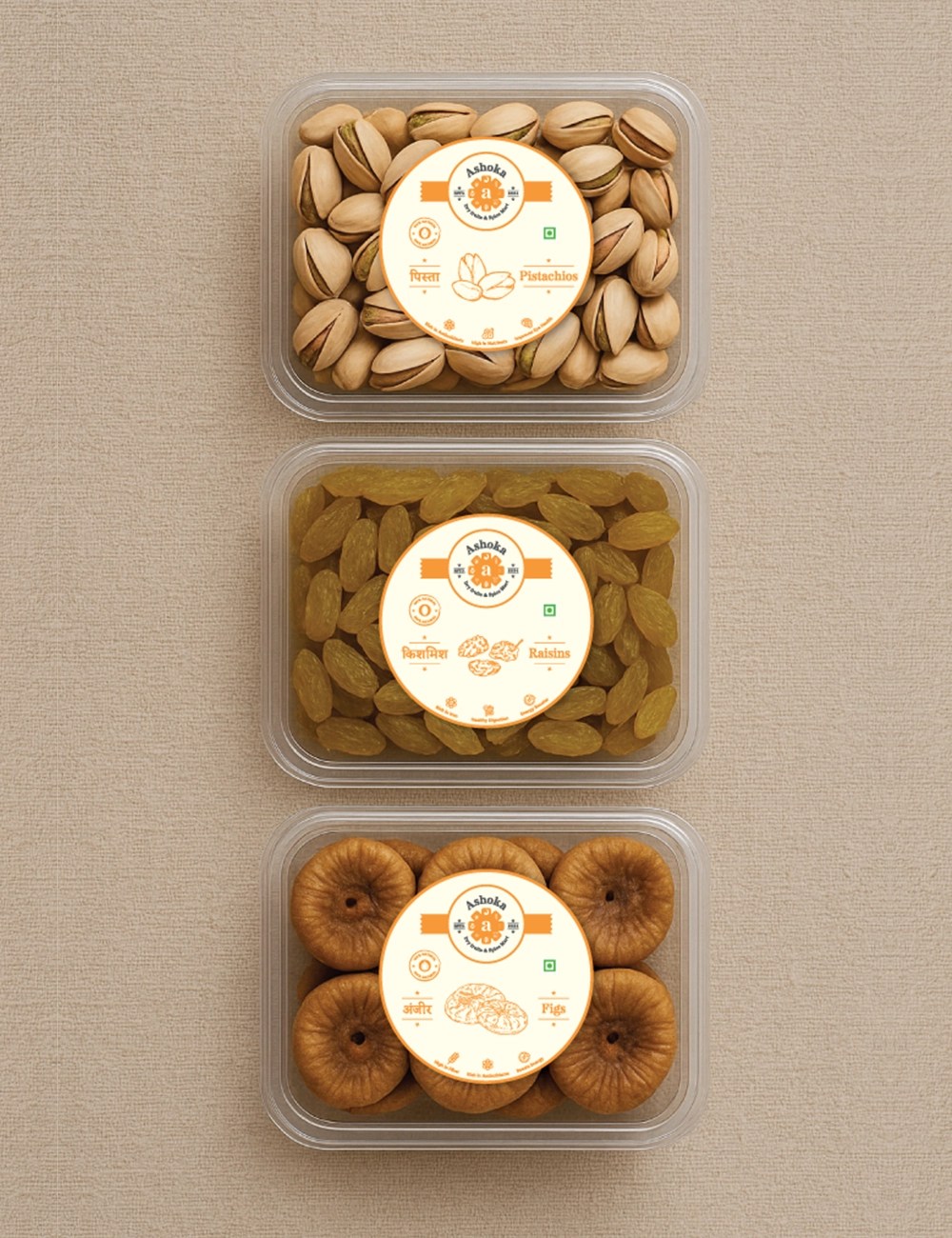
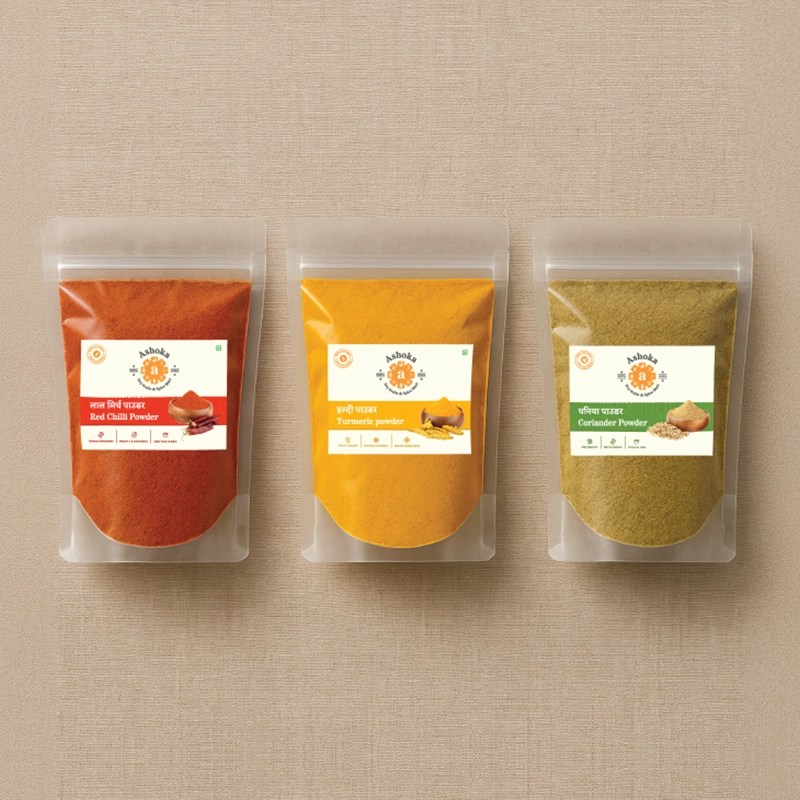
Packaging & Brand System:
The unified label design makes Ashoka instantly recognizable across dry fruits, spices, and chocolates.
Clean layouts, familiar motifs, and bright colors bring freshness without losing authenticity.
The Outcome:
A cohesive, scalable identity that helps Ashoka look premium, trustworthy, and relatable — standing out in a crowded retail shelf while staying true to its roots.
