Client: Mudenur’s | Sweets & Savouries
Scope of Work: Brand identity, logo system, packaging design, visual direction, and Shopify store development.
The Challenge:
Revive jaggery-based Indian sweets for a modern, health-conscious audience. The brand needed to feel authentic and rooted in tradition without reading as old-fashioned. It had to communicate purity (no refined sugar, no preservatives) while feeling premium and usable across packaging and digital.
The Idea:
Pure sweetness for modern life.
Position Mudenur’s as a heritage-forward brand that makes daily, guilt-free indulgence possible. Visually, the brand should read as handcrafted, warm and honest — not rustic or commodity-like. The identity anchors on a terracotta-inspired primary color (warm, soil-and-clay tone) that evokes warmth, craft and regional roots while remaining contemporary and premium.


The Process:
- Discovery: Mapped founder story, family recipes and category players. Mapped white space between purely traditional karigari brands and clinical “health snack” brands.
- Strategy:
Position: “Handcrafted, honest sweets redesigned for everyday life.” Audience: health-aware families and urban professionals seeking natural alternatives to sugar-based sweets. - Visual Direction:
Core keywords: Authentic, Pure, Familiar, Warm, Premium.
Primary color: terracotta-inspired warm red — chosen for its craft/earth connection and shelf distinction. Secondary palette and neutrals were built for premium contrast and copy legibility. A refined sugarcane motif was developed as the marque frame to reference source without literal commodity visuals. - Delivery: Visual system + logo animation + packaging that mirrors the brand’s spark.
Identity Design:
A confident, handcrafted wordmark paired with a refined sugarcane frame. The cane was simplified into elegant vector segments to read as a premium motif rather than an illustrative literal. Typography pairing balances expressive title forms with clean, readable supporting fonts for pack and web.
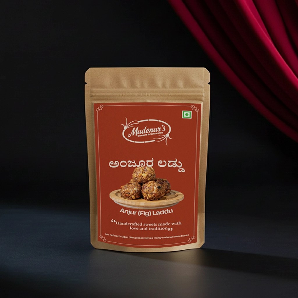
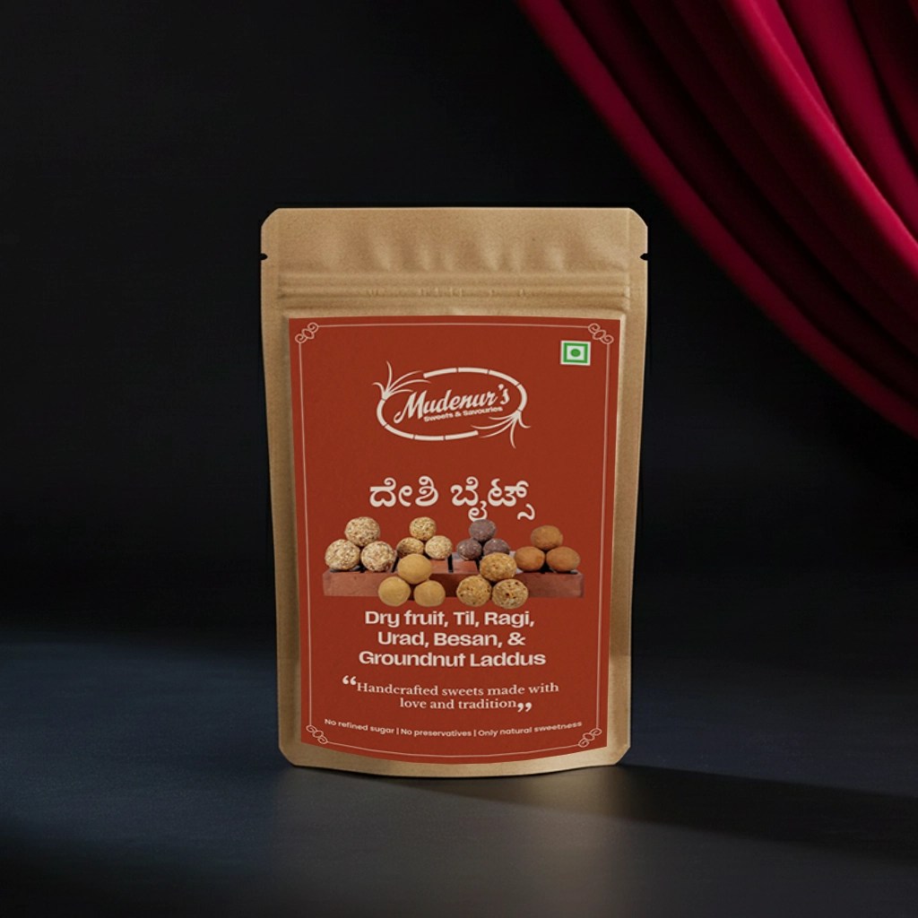
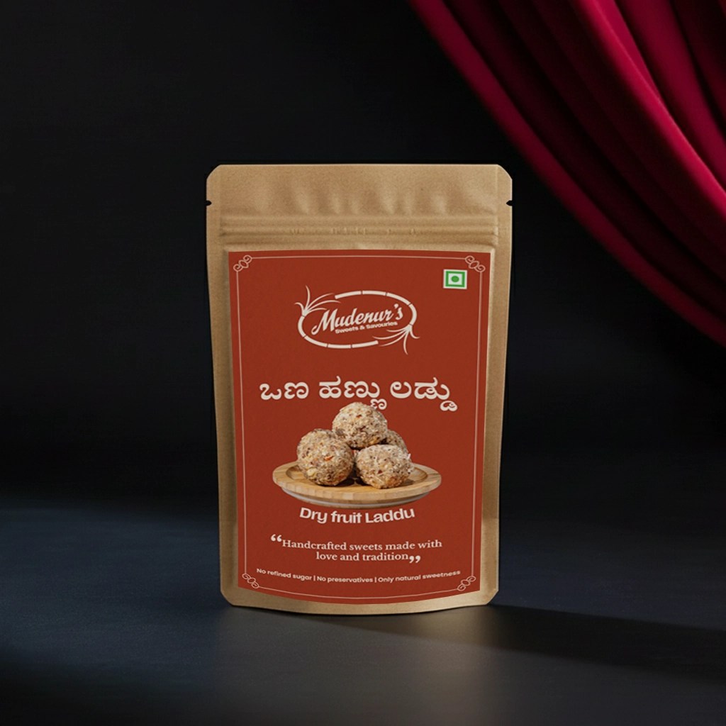
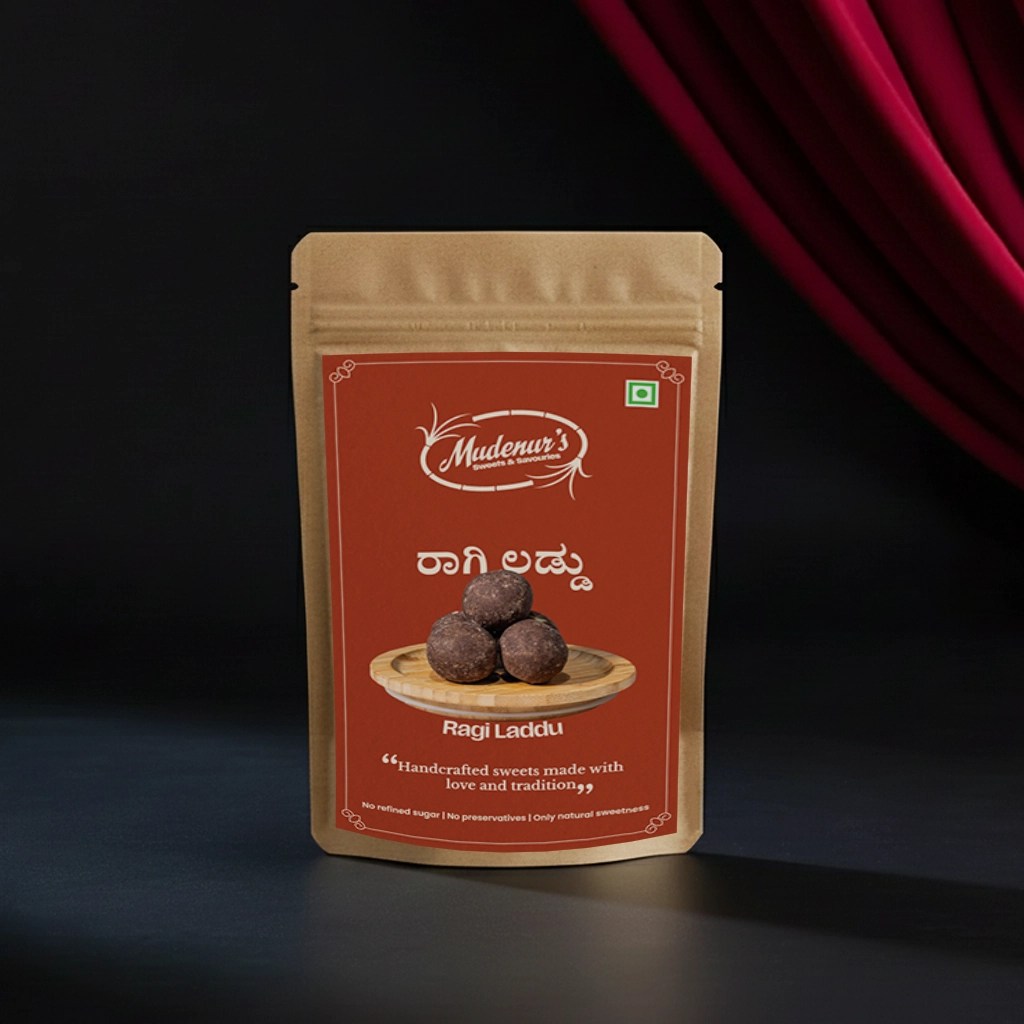
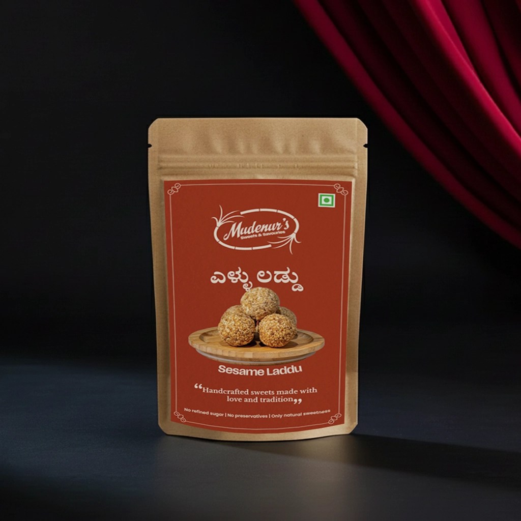
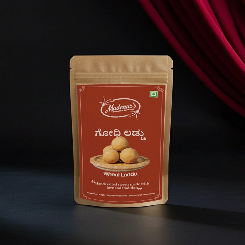
Packaging:
Packaging follows a restrained layout: bold product name, clean product photography on a wooden surface, and tactile terracotta background with subtle border details. Bilingual labels (English + Kannada) maintain cultural authenticity. Front-panel claims are honest and verifiable: “No refined sugar | No preservatives | Only natural sweetness.”
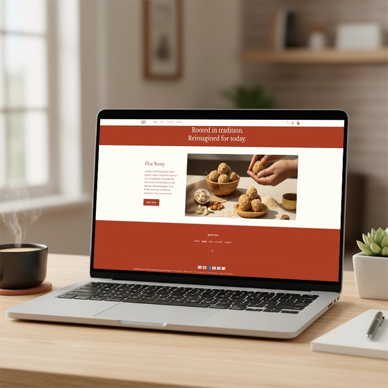
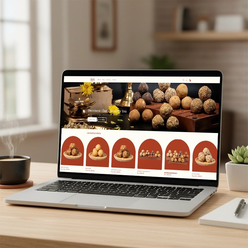
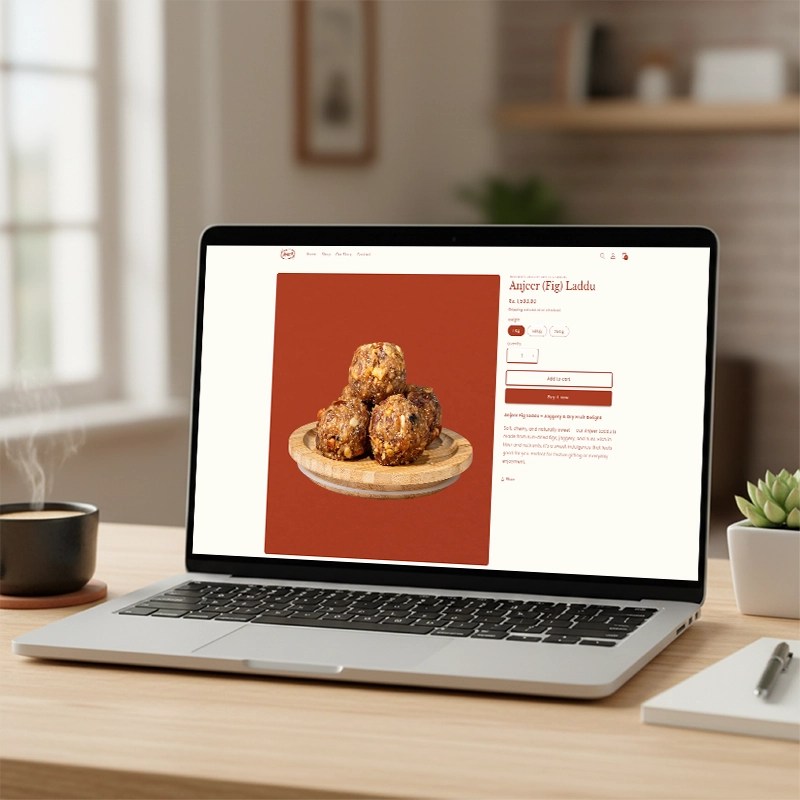
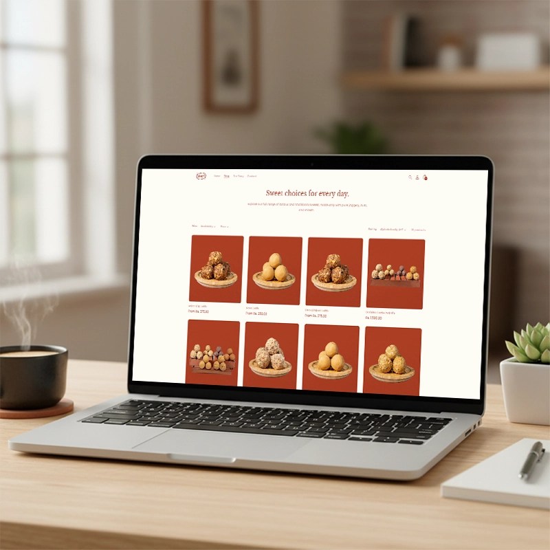
Digital experience (Shopify):
Product pages optimized for SEO and transparency: clear ingredient lists, allergens, shelf-life, and story-driven copy (“handcrafted in small batches”). Homepage storytelling connects craft (kitchen) with modern life — converting trust to purchase.
Outcome:
A cohesive brand system that balances heritage and modernity. Mudenur’s now reads as a premium, trustworthy maker of jaggery-based sweets — visually warm (terracotta-led), honest in claims, and scalable across SKU range and digital commerce.
