Client: Watt-a-Nut | Elemental Inc.
Scope of Work: Brand identity, packaging design, logo animation, and brand pattern.
The Challenge:
Create a bold, energetic identity for Watt-a-Nut — a brand built on the idea of “Sanak” (passion). The design had to go beyond dry fruits and connect with anyone driven by their spark.
The Idea:
“Watt” meets “Nut” — energy and obsession.
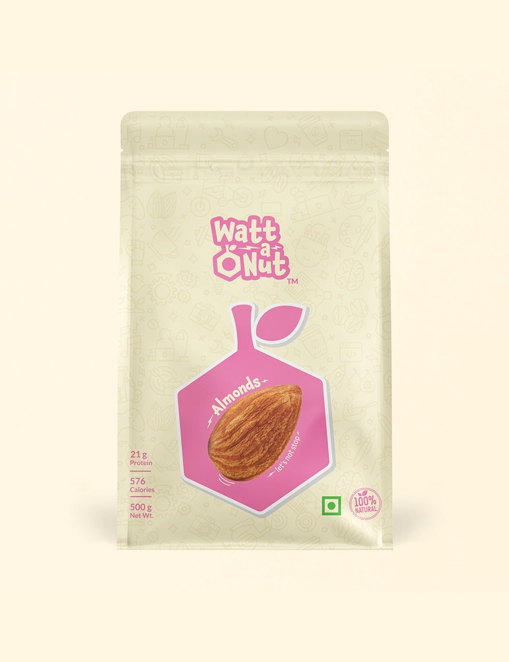
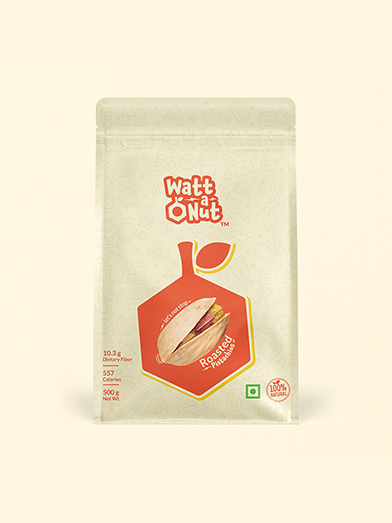
The logo combines an electric bolt with a mechanical nut, symbolizing drive and creativity. Purple became the core color for its boldness and uniqueness in the category.


The Process:
- Discovery: Deep dive into brand philosophy, audience, and competitors.
- Exploration: Multiple logo concepts, refined through collaboration.
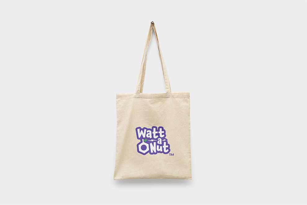
- Execution: Final wordmark designed for flexibility across print, digital, and packaging.
- Delivery: Visual system + logo animation + packaging that mirrors the brand’s spark.
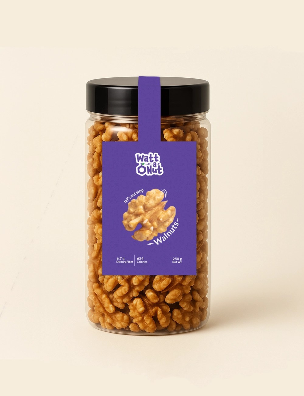
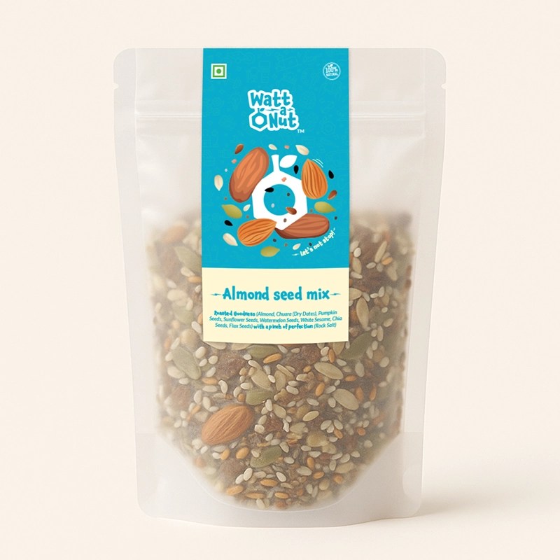
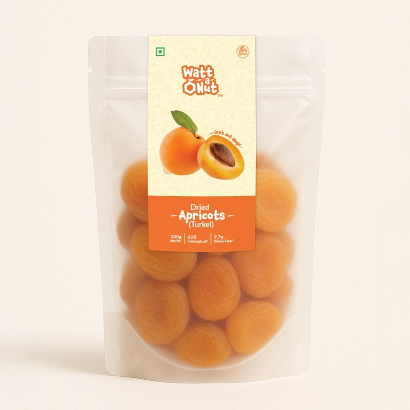
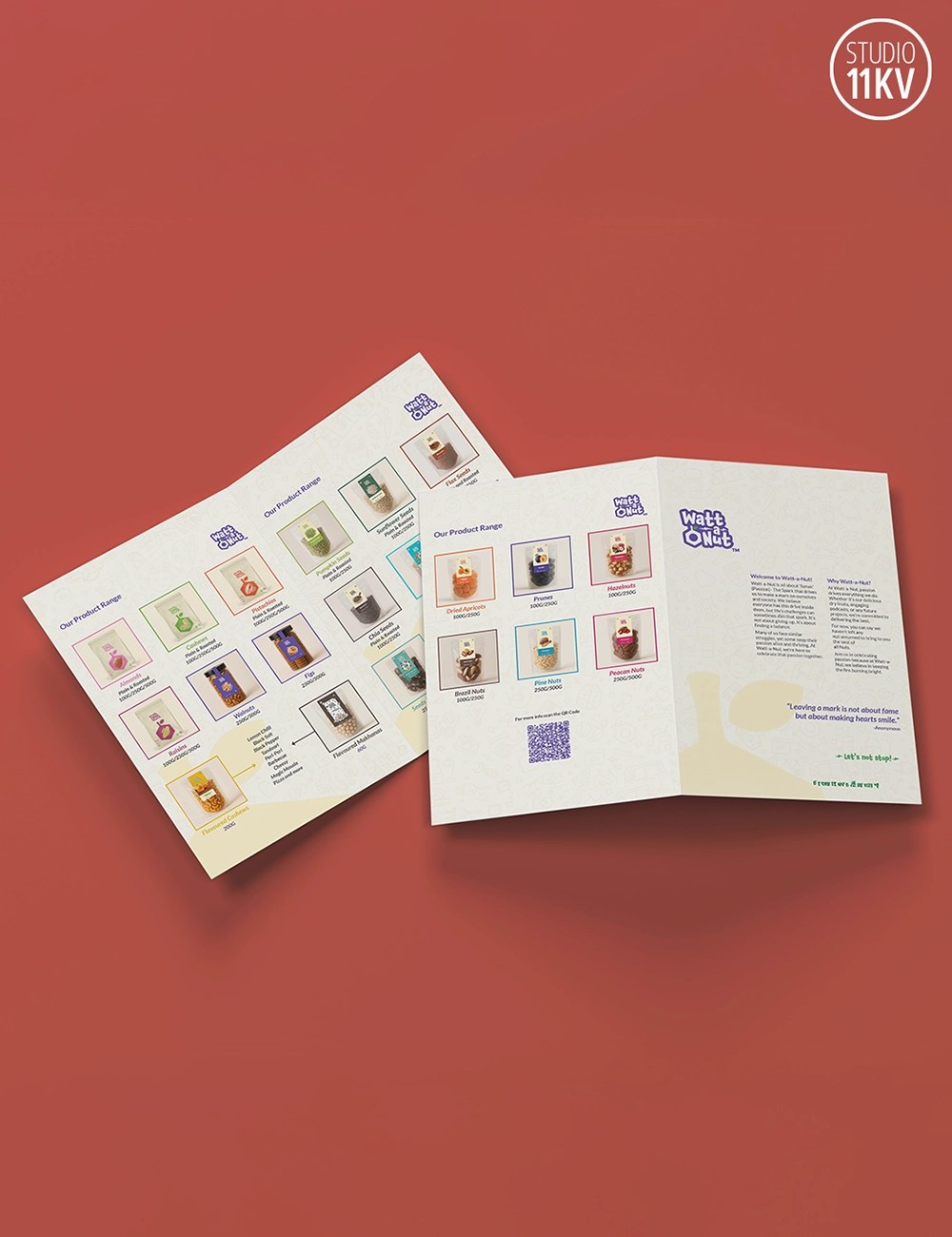
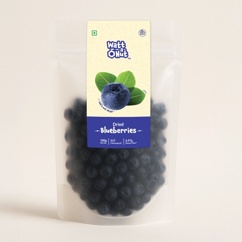
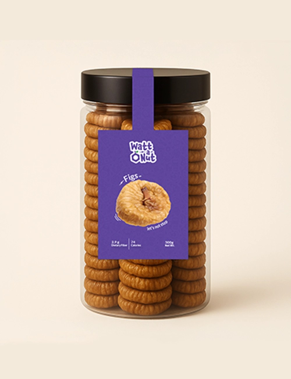
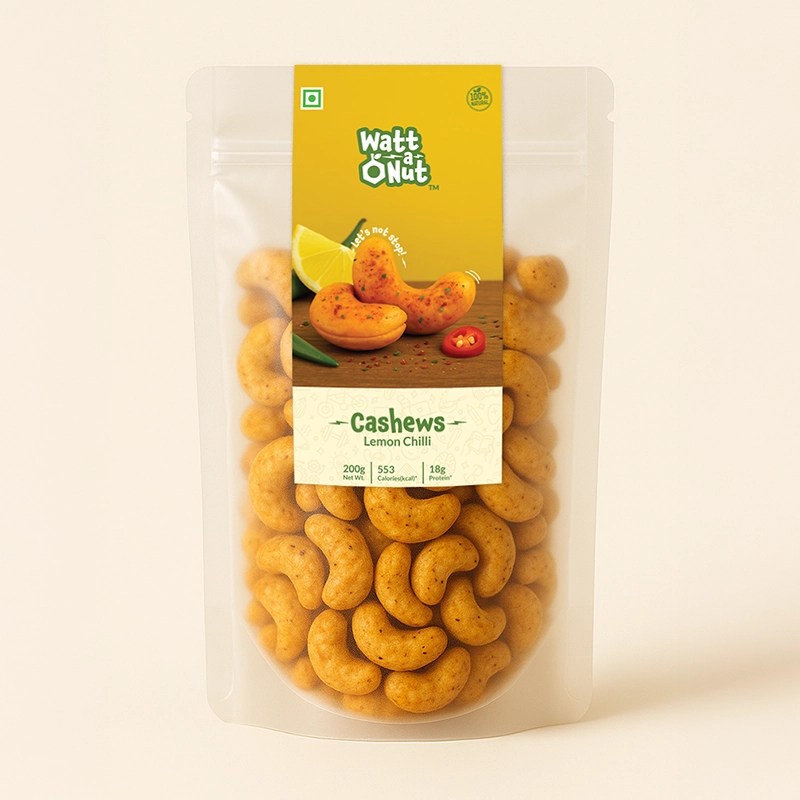
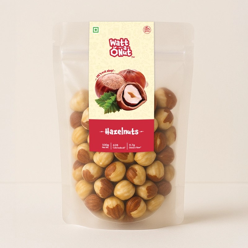
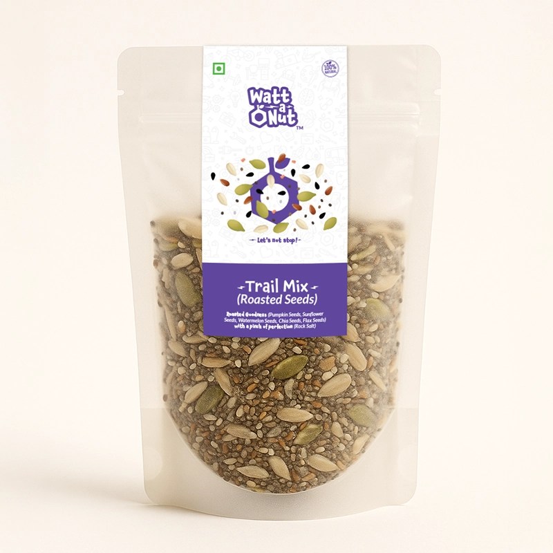
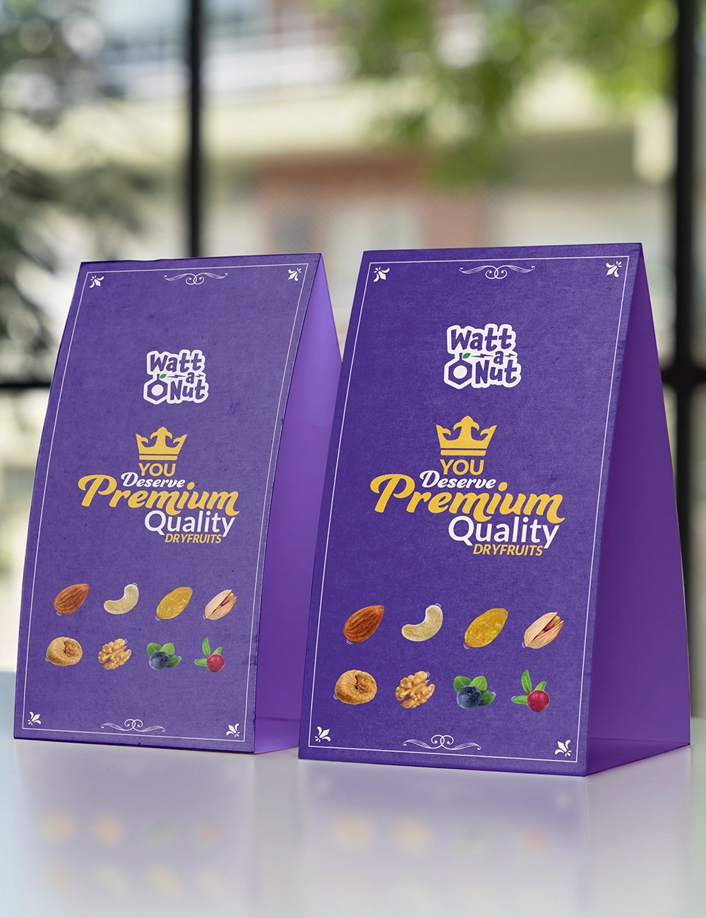
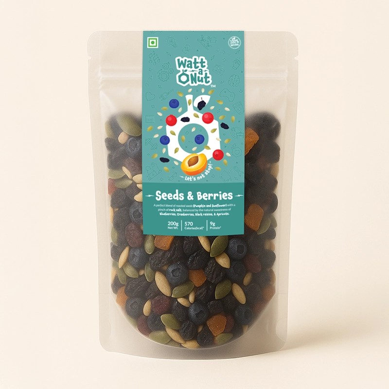
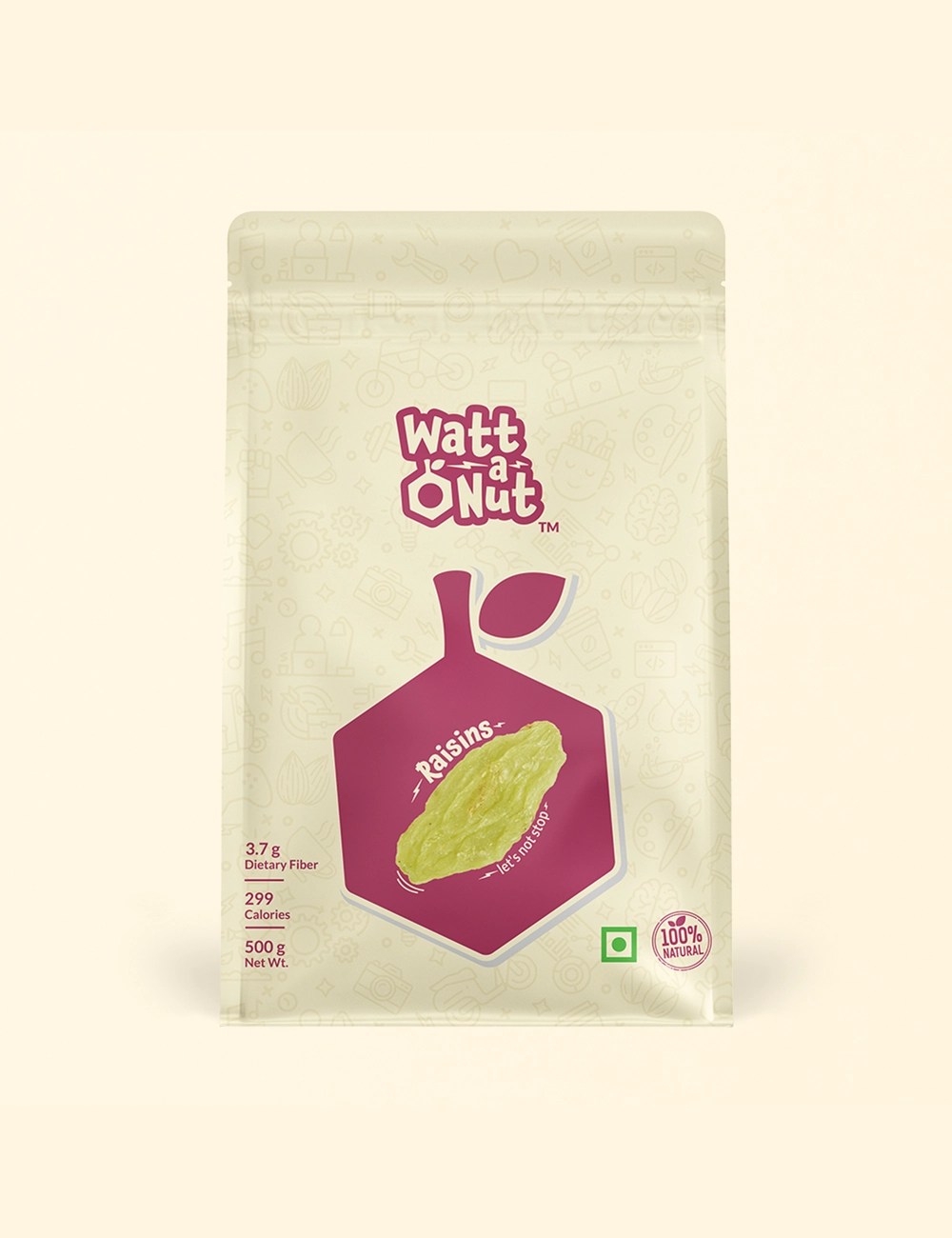
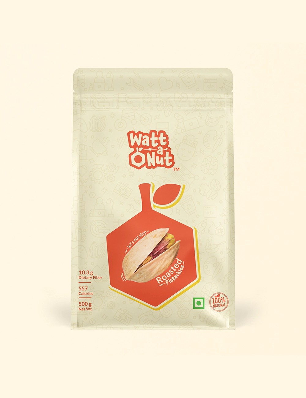
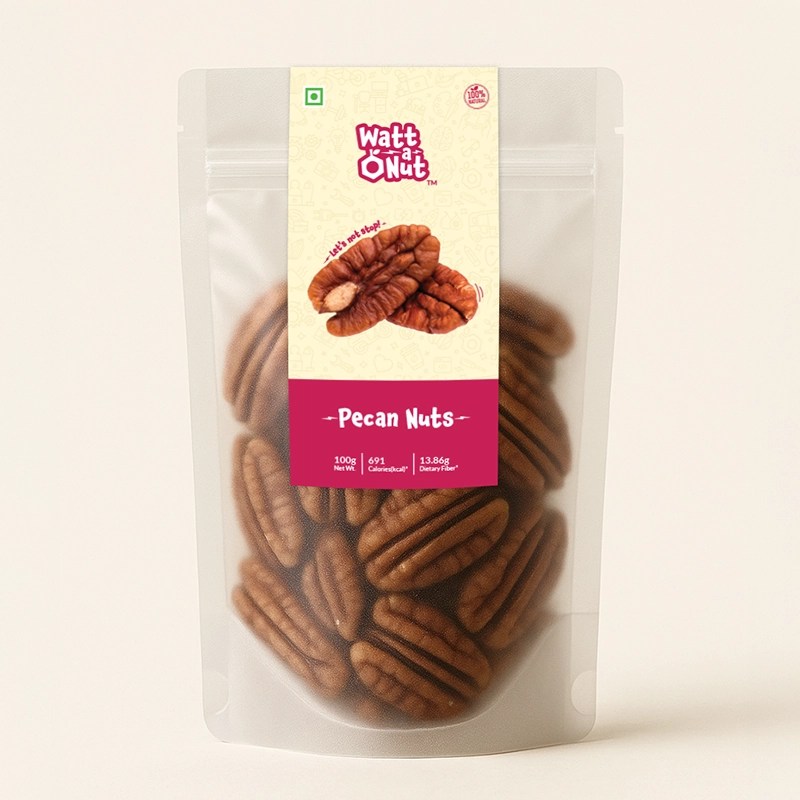
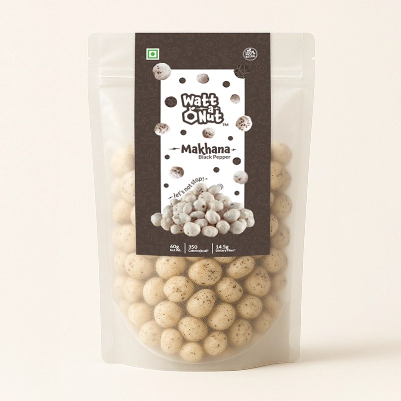
Packaging & Brand System:
The nut icon and bolt motif extend into the packaging and podcast identity, creating a cohesive visual language.
A custom brand pattern and leaflet added a playful layer to customer engagement.
Outcome:
A bold, modern identity that captures Watt-a-Nut’s spirit — energetic, passionate, and instantly recognizable on shelf and online.
